Recently, I got my hands on GPT-5.6 and wanted to take it for a proper spin. I was not interested in another benchmark or another todo app; I wanted a practical test of how well the model could shape a UI prototype from a loose product problem.
Would it fall back to the same blue-and-purple gradients, floating cards, and glossy AI slop, or could it help produce something genuinely useful? I set up a small design exercise to find out. This was not a controlled model evaluation; this post is about what I learned when the first plausible interface arrived almost too easily.
I mocked a fictional product called PantryPilot, an assistant for helping a tired parent turn what was already in the kitchen into dinner. The fictional constraint was familiar: leftovers, vegetables that needed using, half a packet of pasta, different preferences, a budget, and little energy left to think. Because PantryPilot was invented for the exercise, I was exploring a hypothesis rather than claiming to know what families wanted.
GPT-5.6 quickly sketched an intake flow, mock data, result cards, follow-up choices, and alternative layouts. The first serious pass looked plausible, but tried to be a landing page, chat assistant, and recipe browser at once. I was polishing the first product shape before deciding whether it was right.
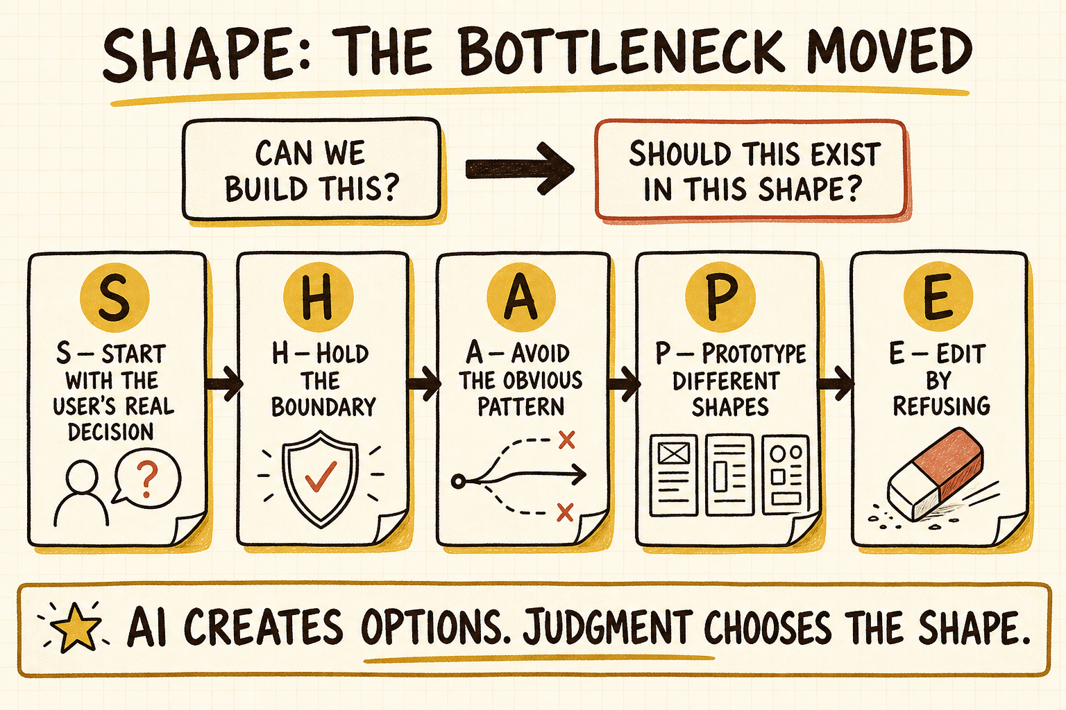
That shifted my question from “Can we build this?” to “Should this exist in this shape at all?” I later called the five repeated checks SHAPE: a mnemonic for familiar product practices, not a new theory or a framework I had followed from day one.
- S - Start with the user’s real decision
- H - Hold the boundary
- A - Avoid the obvious pattern
- P - Prototype different shapes
- E - Edit by refusing
S - Start With the User’s Real Decision
My first framing was a familiar product flow: ask a few questions and suggest recipes. The alternative hypothesis was that a tired parent might not be looking for recipe inspiration at all. They might be trying to decide what can be cooked without shopping, what can be ready before everyone gets hungry, what needs using soon, and what could become lunch tomorrow.
I keep the word “real” in SHAPE because the product must eventually meet a real decision, not because this mockup had already discovered one. At this stage, S should leave behind a decision hypothesis and a note about what user evidence would confirm or change it.
That hypothesis changed the intake. Instead of opening with cuisine, calories, or a blank chat box, PantryPilot started with four quick questions:
- Who are you feeding?
- What do you already have?
- What needs to be used soon?
- What matters most tonight?
If someone was unsure, the mockup could make a clearly labelled demo assumption and show it beside the result. PantryPilot now started with what was already in the kitchen and showed three candidate dinner paths. The starting point had moved from an empty recipe search to the situation already sitting in the kitchen.
H - Hold the Boundary
Fictional did not mean consequence-free. PantryPilot was not a nutritionist, allergy authority, medical diet planner, checkout flow, or proof that food was safe; if a claim required an exact label, preparation, or storage history, it did not belong in the interface.
That boundary matters because Food Standards Australia New Zealand says food allergies can be life-threatening, advises people with food allergies to check labels every time, and directs diagnosis and ongoing management to experienced doctors and allergy specialists. Its food-safety guidance also says to follow storage and cooking instructions and never eat food past its use-by date. The mockup had no access to an exact label or a leftover’s time and storage history, so it could offer a meal idea but could never verify that the idea was allergy-safe or safe to eat.
That boundary changed the copy: “meal idea” instead of “recommended diet”, “mock price estimate” instead of real cost, and “likely fit” instead of “best meal”. Allergy advice, health claims, checkout, and fake certainty stayed out, while safety-critical uncertainty remained visible because polished cards and scores can make mocked output look authoritative.
A - Avoid the Obvious Pattern
“Avoid” means noticing when a default pattern takes over before proving it helps the user decide. Here, that default was a recipe website with chat attached.
The first pass accumulated a text box, answer chips, transcript, full meal cards, filters, shopping controls, disclaimers, and competing calls to action. The brief had not defined the first useful answer, and AI made plausible additions cheap, so I reviewed the screen against five lenses.
| Review lens | Concern I would test |
|---|---|
| First-action visibility | The hero placed the first useful action below nonessential content. |
| Input competition | Free text and answer chips offered two competing ways to respond. |
| Visual hierarchy | Full meal cards dominated the screen before the first decision was complete. |
| Trust and clarity | Labels such as “Best match” overstated what mocked data could support. |
| Mobile path | Multiple full cards pushed the next decision several screens down. |
Against my criteria—a fast first answer, low effort, visible uncertainty, and a clear mobile path—these were hypotheses to test, not observed behaviour. That was enough to stop treating the first pass as the default: the danger was a polished interface for the wrong product.
P - Prototype Different Shapes
Once the default was visible, I stopped adding implementation. I compared five organising concepts using the same questions: first useful answer, effort before it, visible trade-offs, and main clarity or certainty risk.
| Organising concept | First useful answer | Effort before value | Trade-offs made visible | Main risk to test |
|---|---|---|---|---|
| Pantry X-Ray | What can be used now | Medium | Availability and urgency | Becomes an inventory tool |
| Dinner Timeline | What to start first | Medium | Time and parallel effort | Becomes a process planner |
| Lunchbox Pack Builder | One repeatable lunchbox | Medium | Reuse and backup options | Becomes too narrow |
| Meal Sculptor | One candidate meal path | Low | Time, effort, cost, and leftovers | Controls create false precision |
| Fridge Delta Board | What changes after a meal | High | Waste, shopping, and reuse | Becomes a dense dashboard |
This was directional self-assessment, not user data, but it made the choice inspectable. Because fast value and honest uncertainty outranked breadth, I chose Meal Sculptor: one candidate meal path with visible trade-offs and two alternatives after a follow-up. Pantry X-Ray and Dinner Timeline centred inventory or sequencing; Lunchbox Pack Builder narrowed the job; Fridge Delta Board required more work before showing dinner. Those contrasts made Meal Sculptor the hypothesis to test next.
I resisted recombining all five concepts. Pantry X-Ray informed capture and Fridge Delta Board informed what would be used or remain; Dinner Timeline and Lunchbox Pack Builder stayed later hypotheses rather than primary-flow features.
E - Edit by Refusing
Reviewing the obvious default exposed how the design had drifted into a recipe website, while comparing different product shapes changed the direction to Meal Sculptor. Editing by refusing then changed what appeared first: I removed the persistent text box and transcript, sticky result dock, duplicate actions, filters, multiple full meal cards, decorative reassurance, and controls that did not reshape the result.
I kept the mocked-prototype label, four-step progress promise, answer chips, “Not sure”, “Skip for now”, a collapsed free-text escape hatch, one starter meal, and accessible assumptions. The sequence became one active question, one compact summary, one starter answer, and one primary path, with alternatives after that answer.
Here taste meant refusing to call mocked output a recommendation, show three full cards when one starter path was enough, or hide uncertainty behind polish. The smaller mockup made the lesson concrete: more output is not more clarity.
What the Evidence Supports
Andrew Ng argues that agentic coding can make deciding what to build a Product Management Bottleneck. In DORA’s thematic analysis of 1,110 open-ended survey responses, Google software engineers reported that some time saved during generation returned as prompting and verification work.
These are different kinds of evidence: Ng offers an interpretation, while DORA reports self-described experience. Together they support a narrow observation that AI-assisted coding can shift effort from implementation towards planning and verification. They do not show that SHAPE improves product outcomes.
Leave a SHAPE Decision Record
Bring the current prototype, the user situation you believe it serves, and the evidence or constraints behind its claims. Run the review until each row leaves a recorded decision rather than another idea.
| Check | Do | Record before moving on |
|---|---|---|
| S - Start | Write: “When ___, the user must decide ___ despite ___.” Define the smallest answer that helps, plus the evidence that could change this hypothesis. | One decision hypothesis, the first useful answer, and the evidence that would revise either one. |
| H - Hold | List what the product cannot know or support; change or remove copy that crosses the boundary. For consequential claims, record the supporting source, what remains unknown, and the human check required before use. | A must-not-imply list, permitted wording, and the evidence path for consequential claims. |
| A - Avoid | Name the familiar pattern the first pass has drifted towards; test it against speed, effort, clarity, trust, and mobile use. | The pattern to retain or reject, with the conflict that decided it. |
| P - Prototype | Compare at least three genuinely different organising concepts against the same criteria. | A visible comparison, the chosen hypothesis, and a next test with one supporting signal and one result that would make you revise or reject it. |
| E - Edit | Remove elements that neither change the decision, expose uncertainty, nor help completion; then rerun the primary path. | A remove/keep log and a first-useful path that still works. |
PantryPilot’s Filled Record
| Check | Recorded decision |
|---|---|
| S - Start | Hypothesis: When food is already in the kitchen but time and energy are limited, a parent must decide what can become dinner despite incomplete ingredients, preferences, and uncertainty. First useful answer: one candidate meal path with visible assumptions. Revise if: observation shows that recipe inspiration, not a constrained dinner decision, is the real job. |
| H - Hold | Do not imply allergy safety, food safety, medical nutrition advice, real pricing, or checkout. Use “meal idea”, “mock price estimate”, and “candidate path”; an exact label, preparation and storage history, and an appropriate human or authoritative source would be required before any consequential safety claim. |
| A - Avoid | Reject the recipe-browser-with-chat default because the hero, competing input methods, and full meal cards delay the next decision and make mocked output look more certain than it is. |
| P - Prototype | Choose Meal Sculptor because time to first useful answer and honest uncertainty outrank feature breadth. Support if: target users can reach a candidate meal, explain its assumptions and limits, and choose a next action. Revise or reject if: they mistake it for safety advice, cannot explain a key assumption, or cannot decide what to do next. |
| E - Edit | Remove the transcript, sticky dock, filters, duplicate actions, and multiple first-view cards. Keep the prototype label, guided choices, free-text escape hatch, one starter path, and visible assumptions; rerun the path from question to candidate meal to alternatives. |
That record is useful before the product has been validated because it makes the assumptions, exclusions, trade-offs, and failure signals inspectable. If the next test failed, I would return to the SHAPE row that held the wrong assumption instead of asking AI for more polish.
Because this exercise began with a first pass, P does not mean refusing to code until every product decision is solved. Light prototypes and technical spikes can expose feasibility, risk, and cost, but they should inform commitment rather than make the first plausible direction inevitable. The checks can loop whenever a new artifact or user test exposes a weak assumption.
The Bottleneck Moved Here
AI made the options cheaper to create, which made choosing between them more important in this exercise. I stopped treating output as evidence that the first idea was correct and started using it as material to compare, challenge, simplify, and refuse. The bottleneck moved for this work, so the workflow had to move with it.